The Principles of Color Coordination: How to Create a Versatile Wardrobe?
In the world of fashion, color is the most direct and powerful means of expression. It can instantly convey emotions, shape image, and even influence others' first impressions of us. Many people, faced with overflowing wardrobes, often feel "at a loss for clothes." This isn't because they have too few clothes, but rather a lack of a systematic understanding of color coordination. A truly effective wardrobe isn't about the number of items, but rather whether they can create a "chemical reaction" between items through scientific color combinations, achieving a "1+1>2" effect. Understanding the principles of color coordination is the key to creating a versatile wardrobe.
Color is so important because it directly influences our visual perception and psychological experience. Scientific research shows that when the human brain processes image information, color is the first element to be recognized, before shape and texture. In fashion, color combinations are not only aesthetically pleasing but also serve as a silent social language. For example, cool colors like blue and gray convey a professional and reliable impression, suitable for business settings; while warm colors like red and orange convey vitality and approachability, more suitable for social settings. Color also has the magical power to transform visual effects. High-brightness, light colors create an expansive effect, perfect for adding volume; low-brightness, dark colors create a shrinking effect, a classic choice for slimming. Understanding these basic principles can help you avoid blindly following trends and maximize the value of every item in your wardrobe.
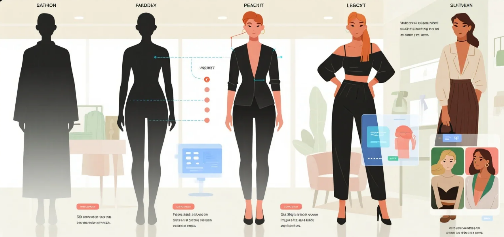
 To master the art of color matching, you must first understand the three basic dimensions of color: hue, saturation, and value. Hue refers to the type of color, such as basic colors like red, yellow, and blue; saturation describes the intensity of a color, ranging from vibrant fluorescent colors to soft Morandi shades; and value refers to the lightness or darkness of a color, with all shades of gray from pure white to pure black representing variations in value. These three dimensions together constitute every color we see. In actual matching, you can create visual harmony by adjusting these three elements. For example, when two colors have significantly different hues, you can balance them by reducing their saturation or equalizing their value. Conversely, when choosing similar hues, you can increase the value difference to create a sense of depth. This ability to flexibly utilize color is a fundamental skill for building a versatile wardrobe.
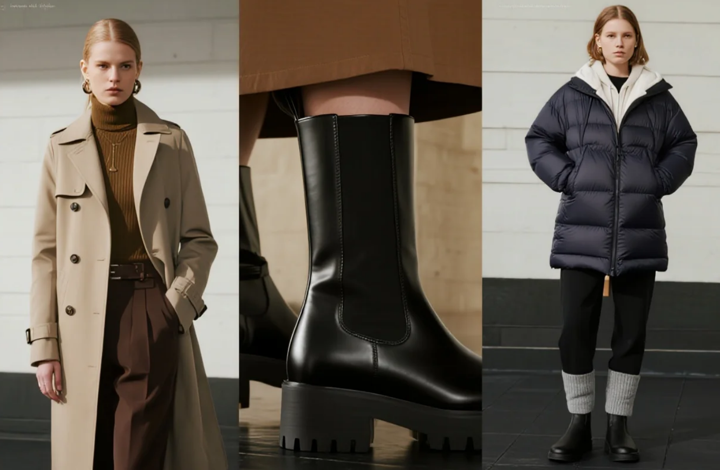
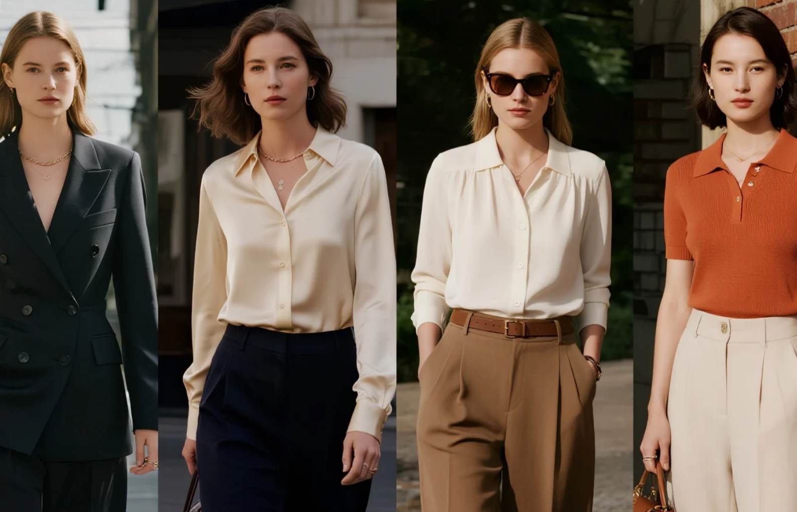
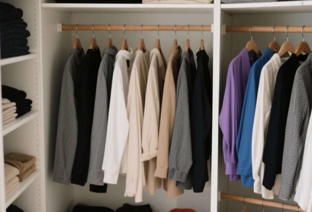
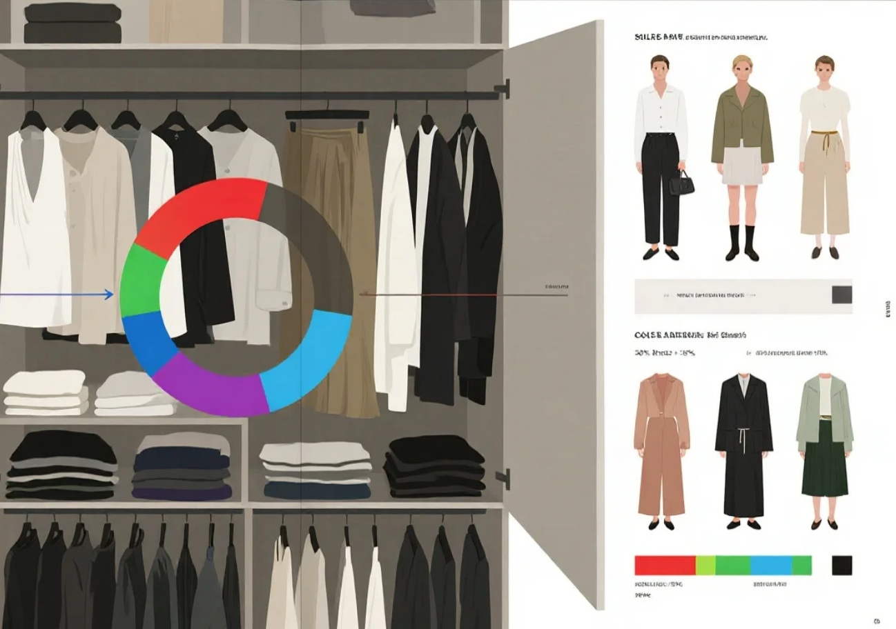
Neutral colors play an irreplaceable role in wardrobe construction. Neutral colors like black, white, gray, beige, and navy act as a canvas, providing a stage for other colors to showcase themselves. A practical tip is to make 60%-70% of your wardrobe neutral. These colors can be combined with almost any other, greatly simplifying the coordination process. The appeal of neutrals lies in their versatility—a white shirt can be paired with any color bottom, and black pants can go well with almost any top. More importantly, neutral items tend to be immune to trends and have a longer fashion lifespan. Investing in a few well-cut, neutral-colored basics made from high-quality fabrics, such as a white shirt, a black blazer, and a beige trench coat, is the smartest way to build an efficient wardrobe. These pieces act like the "superglue" of your wardrobe, connecting other pieces across different styles and seasons.
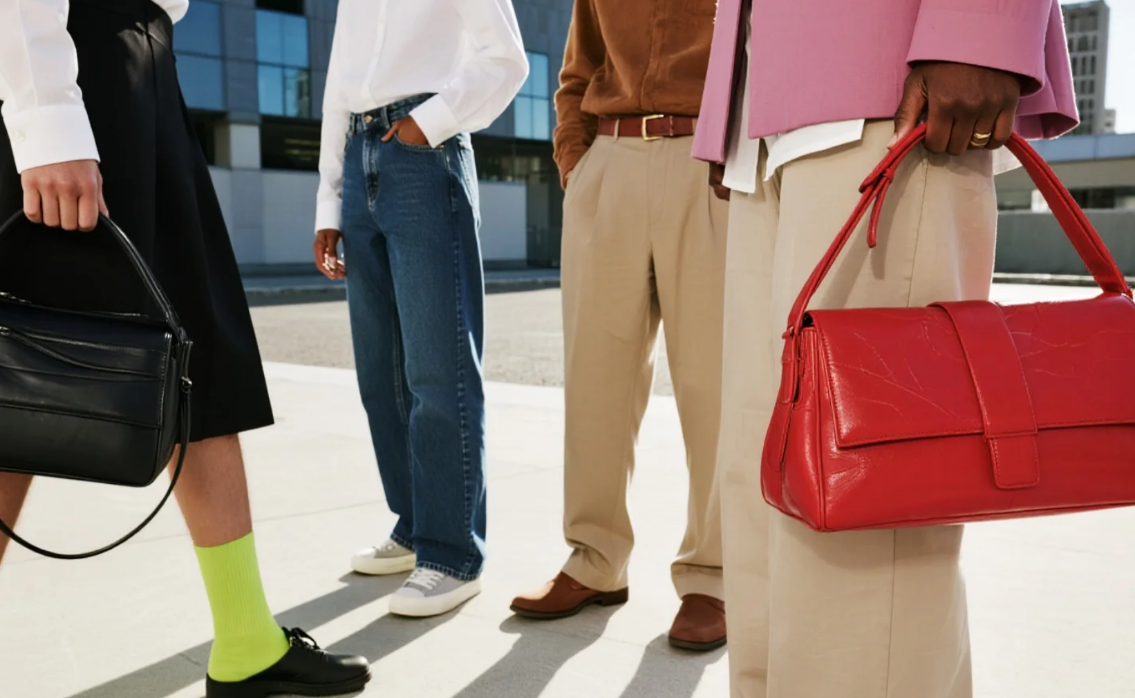
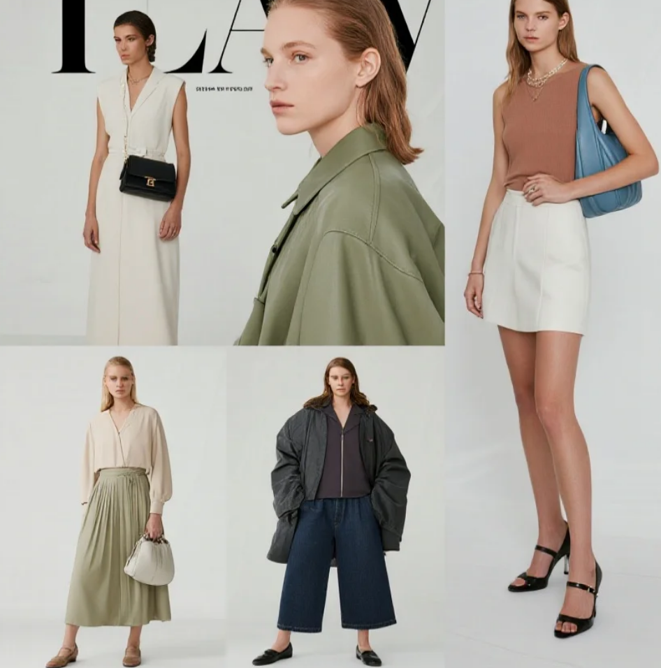
Once the basic neutral color framework is established, you can enrich your wardrobe's expression by adding complementary colors. Accompanying colors typically make up 20%-30% of your wardrobe. Choosing between them should consider two key factors: your skin tone and the occasions you frequent. For those with cooler skin tones, cooler tones like blue-red, turquoise, and lavender will flatter your complexion; warmer skin tones, like ginger, brick red, and olive green, are more appealing. For work, consider adding some low-saturation blues and grays, while for casual wardrobes, consider more vibrant colors. Ideally, these accent colors should complement existing neutrals in a variety of ways. For example, a burgundy sweater can be paired with black suit pants for a formal look or jeans for a casual look. The key is to manage the color balance, adhering to the principle of "large areas of neutral with small areas of color." This allows for a statement piece without appearing overly dramatic.
Accent colors are the finishing touches in your wardrobe, typically comprising only 5%-10% of your wardrobe, yet they can add soul to your overall look. A bright scarf, a colorful clutch, or a pair of vibrant shoes can instantly elevate a basic outfit. You can be bolder with your accent color choices and try colors you might not normally wear in large areas, such as fluorescent pink or electric blue. These small areas of bright color won't detract from the overall look; instead, they can showcase the wearer's fashion sense. When using accent colors, you can apply classic color relationship principles, such as complementary color pairs (red and green, blue and orange, etc.), creating visual impact by choosing two colors that are opposite each other on the color wheel; or analogous color pairs (blue and purple, red and orange, etc.), creating a harmonious and unified effect by choosing adjacent colors. Remember, the smaller the accent color, the more saturated you can be.
The final step in building a versatile wardrobe is to establish color connections. A common mistake is to purchase a single item solely for its aesthetic, ignoring its ability to complement other items in your wardrobe. Ideally, each new item should offer at least three different combinations with existing pieces. To achieve this, establish a "core color palette" for your collection. For example, starting with black, white, and gray, adding dark blue and burgundy as supporting colors, and using gold as an accent color. Try to choose all new items within this color spectrum to ensure they coordinate with each other. Over time, this color system will become more refined, ultimately forming an efficient wardrobe system where all items can be freely combined. This approach not only improves wardrobe efficiency but also helps us make more rational shopping decisions and avoid impulsive purchases.
 Color matching is an art that requires practice, but the basic principles are simple. Start by understanding the three-dimensional properties of color, build a wardrobe foundation based on neutrals, carefully add supporting colors, boldly use small accent colors, and finally, use systematic color relationships to create harmony among all items. Mastering these principles will gradually lead to a versatile wardrobe that is both practical and uniquely personalized. Remember, the best wardrobe isn't one filled with the trendiest pieces, but one where every piece is fully utilized and complements each other. When color matching goes from a chore to a joy, opening your wardrobe every morning will become a creative and exciting experience.